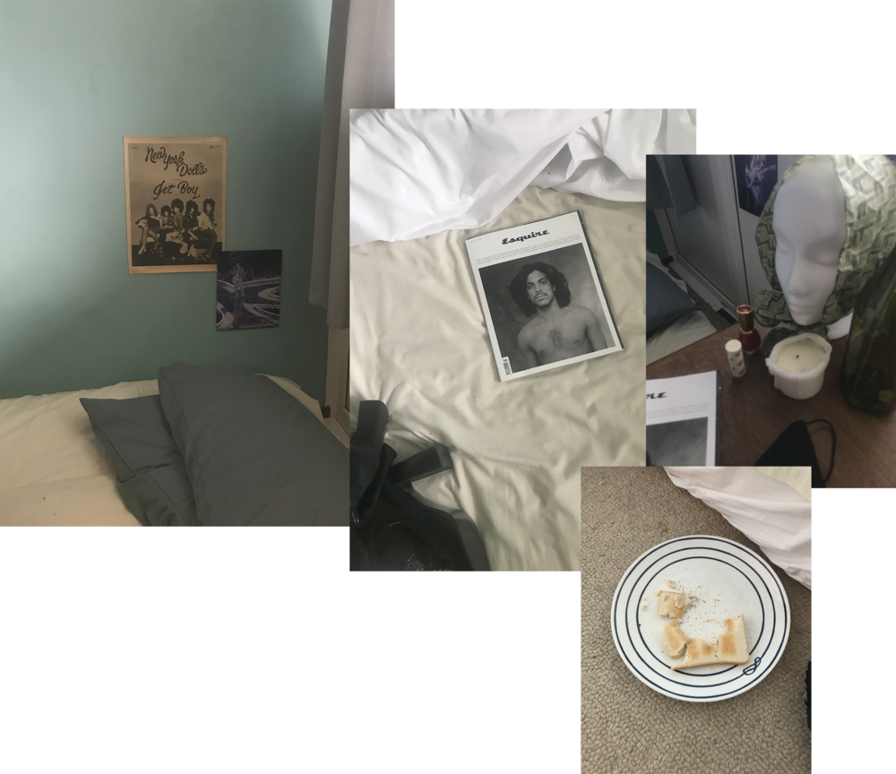
‘Plume’ (2021) | Art Direction & Production Design
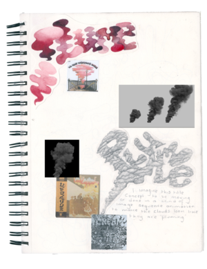
I was asked by the director to create some concept art that would be used in our crowd funding for the film. I played around with the concepts surrounding the meaning of the title, ‘Plume’. Looking at reference images and other forms of artwork, primarily that of album covers, which tied into concepts I created for Ray’s room and his love of music.
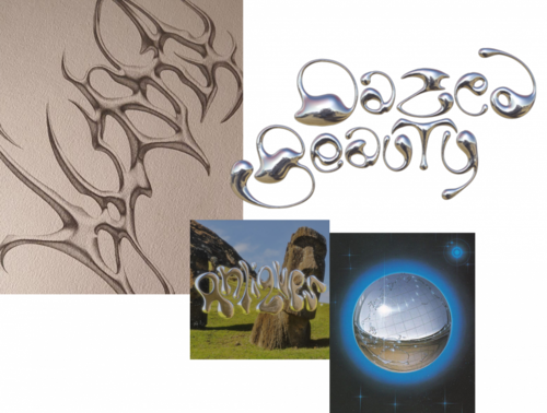
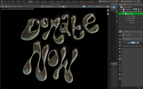
Although I liked the concepts that referenced the title of the film I didn’t think that they were particularly eye-catching. I had recently started to learn blender at the time of coming up with a logo for the film. Dazed Beauty had a very futuristic logo that I thought was very modern and sleek, I decided that through blender I would be able to create something similar. We decided that by using this font in juxtaposition with grainy film footage of children playing it would relay the films message of letting go of the past and moving forward into the future.
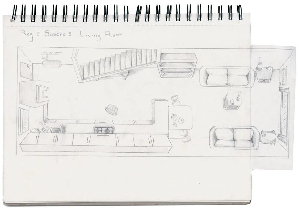
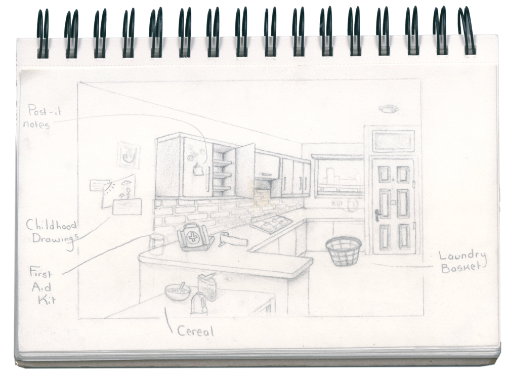
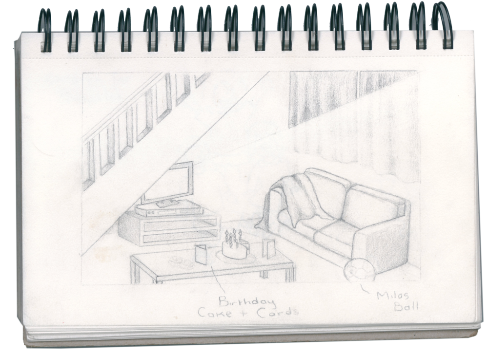
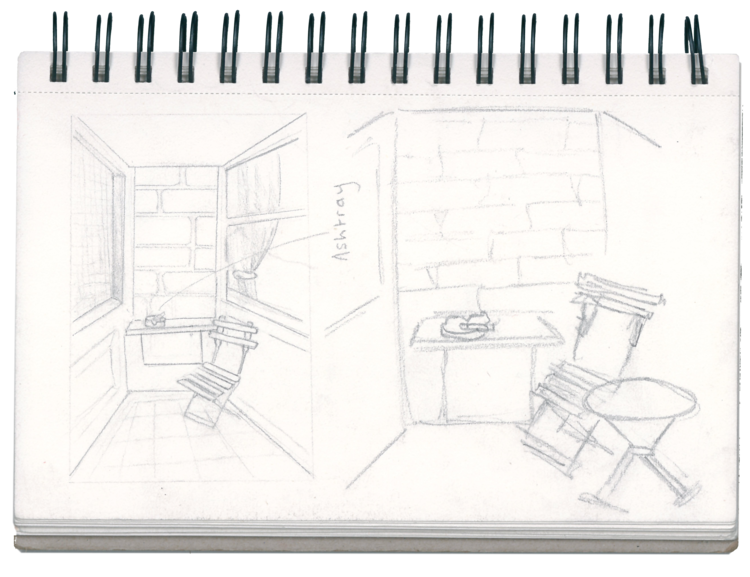
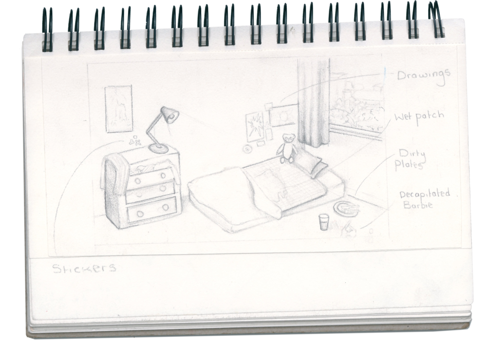
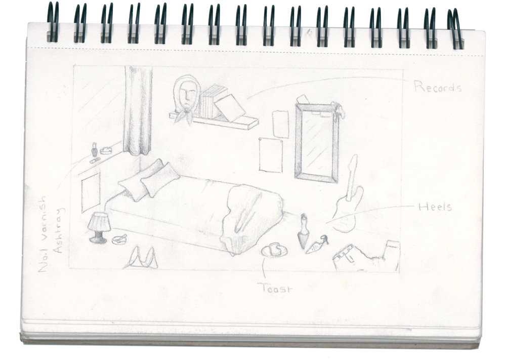
Location Sketches & Floorplans
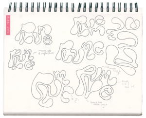
Font Expérimentation
I was asked by the director to create some concept art that would be used in our crowd funding for the film. I played around with the concepts surrounding the meaning of the title, ‘Plume’. Looking at reference images and other forms of artwork, primarily that of album covers, which tied into concepts I created for Ray’s room and his love of music.
Although I liked the concepts that referenced the title of the film I didn’t think that they were particularly eye-catching. I had recently started to learn blender at the time of coming up with a logo for the film. Dazed Beauty had a very futuristic logo that I thought was very modern and sleek, I decided that through blender I would be able to create something similar. We decided that by using this font in juxtaposition with grainy film footage of children playing it would relay the films message of letting go of the past and moving forward into the future.
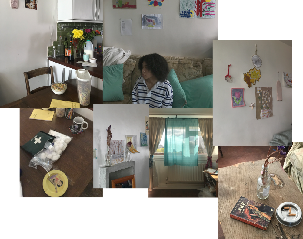
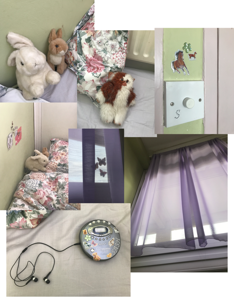
‘Plume is a fragment of Sacha’s (11) life, following the events after her attack on a thirteen-year-old at her apartment complex. As we learn more about Sacha’s motivations and history of volatility, we gauge with the strain being placed on her older brother, Ray (30), who already struggles with his own feelings of dysphoria.’
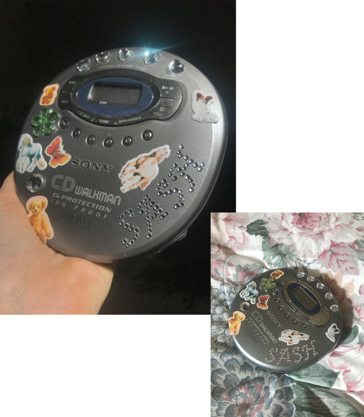
There wasn’t a lot of prop making necessarily involved with this project but more set dressing and sourcing. I mainly collected things from friends who have small children aswell as from family, including my own childhood drawings and belongings.
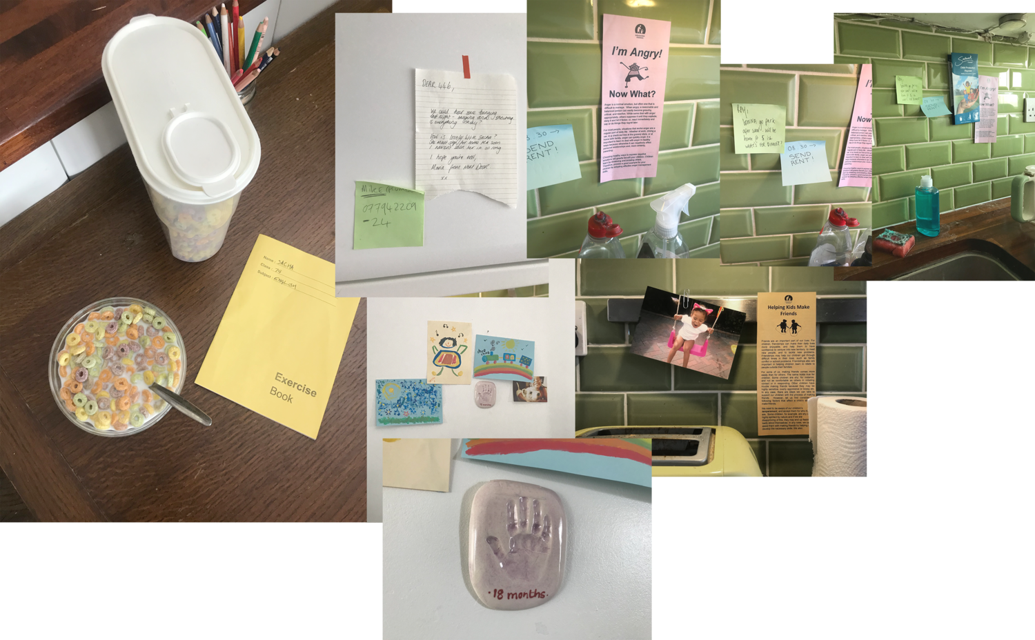
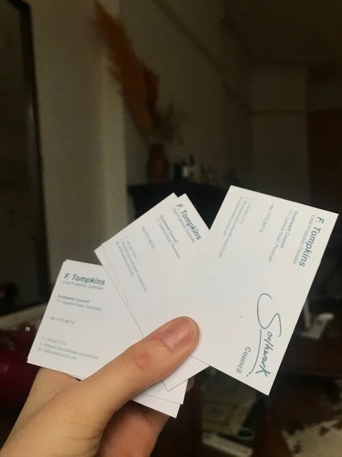
Councillor Business Cards
For both the councillors business cards and the council pamphlet I had to change the logo of the local council. In the script it never specifically states where the council estate is but as we were filming in Oval I thought it was only appropriate to use the local councils logo as reference. I simply just changed the name from Southwark to Soulhwark.
I changed the logo as I believe it is copyrighted.
I found a Business card sizing template online, transferred it to photoshop and then made my cards. I then got them printed at Print Britannia in Whitechapel